Thursday, 25 June 2015

Wix vs Wordpress


   VS


In this post, I will be discussing both the positives and negatives of both Wix.com and Wordpress.com. I used both websites to design and create a website for both an existing and made-up band.


Both websites have a very easy method of being able to customize and recreate the layout of the website you are creating. Here are 2 screenshots of how the customization menu is layed out on each website:

WIX                                                                                   WORDPRESS
                       

In my opinion, the Wix customization menu is much clear than Wordpress', but both do an equally good job. However, the Wix menu is more vibrant and more clear, as it is more simplistic, and overall I think is more attractive to look at. The Wordpress customisation menu however takes you onto a separate tab, which includes a variety of different options to choose from. This is a far greater number of choices to edit your page, which makes Wordpress better in this respect than Wix. 


WORDPRESS


This page too includes multiple choices, including colour changes. Both websites are able to do this, but in my opinion Wix has a much easier and simple way of changing and choosing new colours. Wix brings up all the colours which are clearly labelled and easy to identify, which makes it very easy to change and try out new colours. Wix also does this automatically and on the same page at the time, whereas Wordpress, you have to save and apply the changes, then it has to refresh the page, therefore it is more time consuming. One major problem I had with Wordpress, is that I found it very difficult to change colours of specific things, whereas in Wix, it was incredibly easy to change the colour of anything I wanted, making it very specific and more personal to me and my idea of what a website should look like. 


WIX                                                              WORDPRESS


Additionally, with Wix I was very easily able to add example tracks of the existing artist from the website Soundcloud. All I had to do was change the embed code, then it was done. I found this option unavailable with Wordpress so I did not include any of these tracks in the website. 


However, on Wordpress, there is a huge number of themes available to pick from, more than Wix. These are mainly free, but there is a few which are available to purchase. 


In an example of a direct comparison, I included a gallery of pictures on both websites that I created. In the Wordpress website, there are only three pictures which have no effect or personality to them. However with Wix, I was able to customise the gallery with ease, and I managed to create a 3D gallery which has cool animations to change the pictures. 

WIX


WORDPRESS


My overall opinion about these two website designer websites, is that I think Wix is far more easy to use as it is very simplistic, and is very easy to customise and change anything you want about every aspect of the template. However, Wordpress is also fantastic as it has a huge variety of theme options to choose from, and there are more customisation options available to use. If I had to choose between the two, I would preferably want to use Wix to design any websites in the future. 

Tuesday, 23 June 2015

Website created using Wix

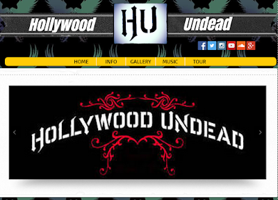
Here is a couple of screenshots of my website that I created using Wix.com, which is a free website creator and editor. 


Here is the link to the website:

http://freddiegass.wix.com/hollywood-undead

Thursday, 18 June 2015

Analysing My Website


I created a website using the software known as ‘Wordpress’. We were told to use this software to help give us the tools to design and create our own websites.

My website is based on the fake band known as ‘Burnt Toast. The band focuses on the genre of rock and alternative rock, and I included many technical and symbolic conventions to help portray this. This first technical convention I used was the layout of the website. There is a large, clear options tab at the top of the page for users to very easily and clearly find and navigate through the bands’ pages and menus. This is a crucial element to any artist or bands’ website, as it clarifies everything into specific areas for their consumers to easily find. This links in with Richard Dyers star theory, as it helps to reflect the ideologies of the band that are being used as commodities in the music industry. Some options in this menu bar include tour dates and also a gallery. Richard Dyers’ star theory tells us, in his third rule of being a successful artist or band, is that there stars must always be present yet also absent to the consumers. The use of a gallery and tour dates allows the audiences to get involved with the everyday lives with the band, to try and be as connected to them as possible. However, the true reality of the absenteeism of the band, helps the band stay desired and wanted to be seen by their audiences, which is the main component which drives up the ticket sales to concerts and festivals, as the consumers want to be physically near and there for their favourite bands.


Additionally, the website has an underlying background picture of a record being smashed, and the header image is of the band members in suits. These conventions are very symbolic as it helps to reflect the genre of music, which the band plays, and also help to portray the ideology of the band. As the genre is rock, the suits help to imply a stylish and cool look, which is often unusual to wear in everyday life, so it gives off a certain rebellious atmosphere, which is the specific ideology of the band. The background pictures of the record smashing again shows a sense of destruction and anger, which represents the genre of rock as rock is very aggressive. Richard Dyers’ star theory discusses that a band must have a certain ideology which they must keep and portray at all times they are within the public eyes. I used these conventions to follow his guidelines, as we are following the bands’ ideologies. It also links in which his theory that all artists and bands are used as a commodity. In this case, our rebellious attitude is being used to help sell as many tickets and merchandise as possible, as this is what ultimately sells to the young, male target audience as they too will be going through a rebellious phase.


Additionally, I wrote a page, which is called ‘About’ which has a brief description of each band member, and I also created a ‘Gallery’ page which includes some pictures of the band members together. Once again, I used these technical conventions to agree with Richard Dyers’ star theory of being absent yet also present and there for the consumers. These pages allow the consumers to be emotionally involved with the band members, and allow them to spot any similarities or even differences they have with them. This will drive up sales as again it makes the consumers have a desire to see the band even further, because if they have any similarities with them, they will want to go and see them live or listen to their music. Additionally, Richard Dyer discusses the idea that the artist or band must be ‘normal’ yet also ‘extraordinary’ in the eyes of the audience.  The use of a gallery helps to portray to the public that the band leads ordinary lives, just like everyone else, but then when they are performing they are seen as Gods. This allows the public to praise them like they want to, but at the same time can be exactly like them, which is great for sales as the audience can feel like they are exactly like them, which will make them feel better about themselves.


Website Created with Wordpress

I created a website for a made-up band called 'Burnt Toast'. This is a created band involving my friends that I decided to create. Here are a few screenshots of the website I created using Wordpress. 


Here is the link to the website:


Comparing Homepages: Kodaline vs Kasabian

Album Artwork - Organic vs Synthetic

In this post, I will be analyzing the artwork of album covers, and applying Negus' Theory of 'Organic vs Synthetic' to these album covers to describe and explain what conventions, technical and symbolic, were used and why.

1st Album Cover:


In my opinion, I think that this is the album cover of an artist. This is because the album cover only has one woman on it, which in my view is to represent the artist. However, upon later discovery that this is a band, this may have been used to confuse their audience, which could reflect the lyrics involved with their songs. I think this is an organic band, as the album cover has very specific feelings and emotions about it, which cold be the construction that the band has achieved by themselves. It seems very artificial The album is expressing a rock/alternative feel about it, because some technical conventions used, such as the whole red background which connotes a dangerous impression, which could symbolize the genre of music. My personal opinion about this album cover is that I don't understand the intentions of the woman and the all-red background is very unattractive, and means you cannot see the woman very clearly. I would not buy this album. 

Some questions i would ask would be:

'Why do you think your audience would like your design?'

'Does the negative character positioning reflect the lyrics in your songs?'


2nd Album Cover:


This is the same band as before. Once again, this has a very organic feel to it, through the style and design of the album. The harsh lighting which creates a shadow implies a very scary/freaky feel, and the wide-eyed man involved, in my opinion, makes the consumer feel very on edge and nervous, as it is very uncomfortable as he seems to be in danger. The artwork again has symbolic connotations of rock genre, as rock stereo typically is very harsh and makes some people uncomfortable to listen to. In my opinion, this artwork is very unappealing as there is no real message involved and it just seems to be too random and unnerving. I would again not buy this album and I am a little surprised that this was a successful album. 

Some questions i would ask:

'Were you worries about isolating your audience with a creepy picture?'

'Does the picture convey emotions portrayed in your songs?'


3rd Album Cover:


Again, this is the same band. This album cover is very different compared to the other two. This one doesn't have any 'creepy' components to it and it is quite refreshing to see a nice landscape and mountains used. In my opinion, I think that the buy standing alone represents the band, who feel that they are very isolated and alone in this world, as they are standing away from the two boys who seem to be friends. However, I would change my view of what genre it would be, as I would say that this would be a classical genre, as the landscape is very relaxing and soothing and beautiful, which are symbolic conventions of classical music. As a result, I think that this would be a successful album and I would buy it. The artwork is very appealing and isn't as weird as their other album covers. 

Some questions I would ask:

'Do the levels of the image and the broad expanse of the landscape represent the global music stage, and do the small children in the foreground represent the minor size of your band standing in front of such adversity in the music industry?'

'Did this represent a change in the genre of your music?'


4th Album Cover:


After having looked at this album cover, I think that this is the album cover of a band. The plain, grey color scheme is one of darkness and simplicity, which could be some symbolic conventions used to portray how this is an alternative genre, possibly acoustic. I think that this band would be very organic, as the album cover shows no evidence of a specific construction or commodity being used, which is a key part of Negus' theory. The simplicity in my opinion too would not be enough for synthetic band to grab the attention of audiences, as its too basic and unappealing. My overall opinion of this artwork is that it is somewhat boring and unattractive, and that it is unsuccessful in acquiring my interest for me to buy this album. 
Some questions I would ask:


'Does the absence of color reflect the bands' emotions?'

'The album is called ''LINES'' but why is there a circle at the bottom?'


Final Album Cover:


This album cover is an interesting one. I think that this some sort of Spanish band, but it has an English written album name. This is because the name ''ROJA'' is Spanish, and the cover has an interesting drawing of a horse being ridden by a woman. I think that is a typical Spanish genre of music, such as Latin Pop or bossa nova. There is a very organic feel to this album because it has a very simplistic and basic color scheme of black and white, but this gives a nice emphasis on the name as it is written in red. The font of the tagline is too in a very Spanish style, which also gives connotations of organic, as it has a very personal implication with it. My overall opinion of this album cover is that it is very visually boring, but the actual drawings of the woman and horse is very cool unique. I would buy this album, despite not liking the black and white color scheme. 

Some questions I would ask:

'What is the significance of the album's name'

'Does the woman used symbolize a specific band member or someone important to the band?' 


Monday, 15 June 2015

Andrew Goodwin's Narrative Theory - Disjuncture

This theory focuses on the idea that there is little connection between the lyrics and the video- the video is completely random and has nothing to do with the lyrics.

Here is an example of a music video:


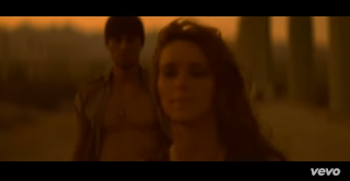
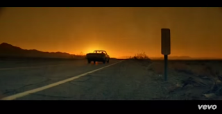
These screenshots are examples of Disjuncture. This is because whats happening in the music video shows no sense of time or meaning, and whats happening on screen has almost absolutely no relationship with any of the lyrics.


Andrew Goodwin's Narrative Theory - Amplification

This theory is about they lyrics. The image amplify the lyrics as a narrative may be used to convey a deeper meaning that would not be picked up from the lyrics alone. The artists may take on fictional roles within the narrative.

Here is an example of a music video:


This is an example of amplification, as the lyrics are talking about being 'in too deep'. The whole video is based at a diving center, so the lyrics' meaning are amplified with the surrounding environment.
Here, this could link in with the lyrics 'faster we are falling'. Once again the meaning are amplified with the environment of the music video.


Andrew Goodwin's Narrative Theory - Illustration

Andrew Goodwin believes that traditional narrative analyses do not comply for music videos. Instead, they are split up into 3 components, the first of which is Illustration. This is where the video tells the story of the lyrics.

An example of this is 'Hero by Enrique Iglesias'


This is an example of Illustration as it tells a story. As the video advances, the story continues, to attract and entice the audience, and to also feel emotionally involved. 


Here is an example of time passing, as the light has faded. There has also been a revolution in the couples relationship, which could show a difference in their relationship as the narrative continues. 

The video ends with the death of Enrique, which ends the story of their relationship. 


Sunday, 7 June 2015

'Like a Prayer' Analysis


I will be analysing the music video 'Like a Prayer' by Madonna, which was released in 1989, and is considered to be one of the most controversial music videos ever created. 


There are many different aspects of this music video which caused disturbance in the ripples of the  music industry. One of the main components is the religious aspect to the music video, as many connotations are used to portray Christianity in an inhumane and disturbing manor. The audience is introduced to burning crucifixes props, and additionally a black character whom is positioned with a cage inside of a church building location. These elements of mine-en-scene help to show christianity to be a sort of evil part of humanity. This was a huge insult to the American society as religion was a huge aspect of everyone's life, which explains why this element alone cause such a stir in controversy. Focusing back on the burning crucifixes specifically, these were used by the racist group known as the Ku Klux Klan, which still existed at the time of the release, but were not as occurring. The burning cross was to symbolise the death, or upcoming death of a black person, as it was seen as a sign of the people do God's work by 'cleaning' society of the black population. This follows onto the racist aspects of the video.

During the time of this videos release, racism was very common and was not illegal or looked down upon in any cases. Throughout the video, an underlying narrative involves Madonna, a black man, and a group of white males. First off, at some points the black man is dressed as Jesus, the symbol and face of christianity. This was UNBELIEVABLY offensive in the eyes of christian followers at the time, as they were racist, and they couldn't have a black man dress up as him. Low angles are also majoritavely used when showing the black man dressed as Jesus, as it represents his power that he has. Madonna is also seen worshipping him, which was offensive as a white person would never bow down to a black man at the time of the release.


This is in tangent too with the group of black people singing as a choir within the church itself. This too was seen to be unacceptable in the eyes of christians as black people were not seen to be religious, or even to be allowed to be inside of a church. The racist aspect continues, as the group of white men conduct a murder on a woman, which the black man later gets arrested for, despite hoping to care for the woman victim. Throughout this murder, the pace of the editing quickens and the number of straight cuts increases, and the use of a handheld camera portrays the danger and speed of this horrific event. Aa the black man is blamed, society became further outraged as it was Madonna's way of stating that not only is society racist, but the actual police force which is meant to 'protect and serve' is also racist, which is highly ironic.


Additionally, sexuality and the role of women in society is also portrayed in a way which was seen as unacceptable at the time of its release. The costume of Madonna is fairly revealing-her cleavage is on show and you can see her bra straps. This works in correlation with the slow-motion shots of her doing erotic hand movements etc. and with the close-up shots of her lips and cleavage too. These show off her sexuality, which is very inappropriate as the majority takes place inside of the church itself. This was seen as bad as churches are the houses of God. This is topped off as, as a result of the character positioning, Madonna ends up sleeping with the black man, on the church floor. This is seen as 2 unforgivable acts, as one side is that they're ruining Gods house with sinful acts, and also as a white woman is sleeping with a black man, which was seen as unacceptable in the time of this videos release.


Monday, 1 June 2015

Music Genres


Here is a list of genres which exist in the music industry:


What is a Music Campaign?

Here is a powerpoint presentation analysing the Website, album cover and music video of an artist. These 3 components make up a music campaign. I will be looking at Drake and Nick Cave and the Bad Seeds. 

Here is Drakes Website:http://www.drakeofficial.com

Music Video 'Take Care':


Here is Nick Caves Website:http://nickcave.com

Here is the Music Video 'We No Who U R':